Walter Darby Bannard: Minimal Color, Lush Form
April 15, 2015 - Altoon Sultan
Walter Darby Bannard: Minimal Form, Lush Color
When I think of minimalist painting, colors that come to mind are primaries and black, as in Mondrian, red/blue/green as in Ellsworth Kelly, white in Robert Ryman: simple clear colors. Robert Mangold uses some offbeat hues, grays and oranges and lemon yellows. But Walter Darby Bannard's color is unique and surprising. In the exhibition at Berry Campbell Gallery "Walter Darby Bannard: Minimal Color Field Paintings, 1958-1965" there are pinks and warm reds and cool greens, and all colors confound expectations with their pleasurable seriousness.
The Model #3
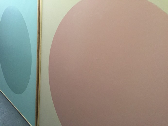
After all...pink? When I think of a great painter using pink, Philip Guston comes to mind; in his works pink becomes a subversive color. Bannard's pink isn't brash and saturated, but subtle; it looks like a mixed hue. The circle sits solidly in its field, perfectly balanced, slightly above the midpoint of a rectangle slightly taller than square. The pink becomes transcendent. In a recent interview, Bannard describes that making these works was very labor intensive:
They required layer after layer of paint. Otherwise you wouldn't get the simplicity and the lack of brushstrokes. It was like Chinese lacquer, you needed the layers to make it work.
Alexander #2, 1959; alkyd resin on canvas, 66 3/4 x 60 3/4 in.
Another of Bannard's formats is a horizontal rectangle situated high on the vertical rectangle's field. The weights of color and form feel very satisfying. The color is beautiful, tertiary reds that carry a lot of light. (The gallery is small and the lighting was uneven, so we have to imagine perfect viewing conditions.)
Marriage #3, 1961; alkyd resin on canvas, 66 3/4 x 62 3/4 in.
Another circle painting shows how color changes the presence of a simple shape. Even in its simplicity, the color turns the painting into something lyrical. We can compare this to Malevich's Black Circle to see a very different expression with the same form.
Cherokee Blanket #1, 1960; alkyd resin on canvas, 66 x 62 in.
I love the nerviness of using a thin shocking pink border (or cherry red; I'm not sure how accurate my color is) for a large field of pink. There is some subversiveness to this use of pink, different from that of Guston: a color usually decorative and frothy is here an atmospheric bounded field, tied to its geometry.
Pacific Glass, 1961; alkyd resin on canvas, 66 3/4 x 62 3/4 in.
Pacific Glass has a similar structure to Alexander #2 above, but a very different sense of light and weight. Like its title it feels translucent.
Aqua Same, 1962; alkyd resin on canvas, 66 3/4 x 62 3/4 in.
Another circle, difficult to see in the sea-colored field. The surfaces, glossy and matte, are what differentiate figure and ground; they create a shifting visual experience, a poetry of color and light.
Yellow Rose #1, 1963; alkyd resin on canvas, 66 3/4 x 62 3/4 in.
A semicircle sits at the bottom of a canvas, yet because of its golden color, does not weigh the work down. It sits, it also rises; it animates the space above it.
Seasons #1; 1965; oil on canvas, 66 3/4 x 62 3/4 in.
This painting indicates a different direction in the minimalist series. The forms bulge, swerve, float, bend. In the interview mentioned above, Bannard says that he became bored with doing the laborious work needed for these paintings. Seeing Jules Olitski's paintings showed him a different way forward.
Bildad's Garden, 1980; acrylic on canvas, 11 1/4 x 34 3/4 in.
Bildad's Garden, a later painting, has the same wonderful sense of color of the minimalist work, with more complexity in the relationship of hue and value. The poured surfaces are rich and varied. I saw this painting last year in a show at the same gallery, titled "Walter Darby Bannard: Dragon Water", which included works from the 70s. There were a lot of beautiful works in this show, which you can see at the link. Both bodies of work show a keen sensitivity to surface and paint, and a vivid and personal use of color.
Back to News
