Color Unabashed in Eric Dever’s New Show in Chelsea
January 17, 2019 - Jennifer Landes for The East Hampton Star
Eric Dever’s recent paintings literally take over Berry Campbell’s Chelsea space. They hang prolifically and fervently on the white walls, bringing the intense hues of spring and summer into the rooms and warming a cold and wind-blown morning.
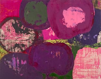
The show, titled “Painting in a House Made of Air,” comes alive with the artist’s unabashed use of saturated, matte, electric, and often acid color. The paintings offer scattered references to Lee Krasner, Joan Mitchell, and even Andy Warhol.
The works on view build on a transformation of the artist’s practice noted in The Star in April of 2017. Before a major illness, Mr. Dever had painted the same way for more than 10 years, choosing a limited square format and a palette consisting of white, black, and red in different combinations at different intervals.
During and after his recovery, the square format was the first to go, and with it the strictures of his previous compositions. Taking inspiration from yoga and his garden, he began to explore the whole spectrum, using color associated with the chakras — areas of energy in the body — as a new launching point for his canvases.
The works in the gallery are from that time but also from the whole of last year, the gambit having stayed with him long after his health returned. The vibrancy makes a strong statement of natural and perhaps internal vitality.
At the time, he said that the floral motifs he adopted early on were “not where I was going to rest.” That seems to be true in some ways. Judging by the dates, titles, and abstracted subjects of his paintings, flowers remain a potent inspiration, whether they are called out in titles such as “Hellebores” and “Calla Lilies” or not.
His titles, without exception, include the date of the month they were painted. He started solely with these as titles but in the past 18 months or so seems to have decided to include other information about the subject or inspiration for the painting.
There are also a number of prickly pear cactus subjects. Do they count as flowers? How about the lavender fields alluded to in “July 16th, Lavender Pilgrimage”? It seems open to personal interpretation. “Lavender Pilgrimage” in particular could be so many things, including completely non-objective. The title instructs the viewer to perceive it as a landscape, and once that association is locked in, the floating planes and patches of color come down to earth, as it were.
It is in the floral paintings that his allusions to Krasner and Warhol appear most obvious. “May 19th, Hellebores II” from last year seems like a slightly deconstructed version of Warhol’s “Flowers,” which figures prominently in the retrospective exhibition of his art that opened at the Whitney in October. “April 1st, Hellebores I,” also from last year, is the most Krasner-like, with a jolie laide palette and rather imposing flattened blooms.
Still, the artist does move on from plants, dabbling in landscape, which is where “Lavender Pilgrimage” ultimately falls. From that same date, he offers “Narrow River,” another seemingly disorganized composition with forms and areas of color that fall into place once the title is known. “August 26th, Glenbarr Avenue,” from 2017 and presumably Los Angeles, given its bright, sun-soaked palette, looks completely abstract. Yet the suggestion of figures, perhaps people gathered in a club to hear music, is what seems to emerge upon further examination.
When he refers to an inanimate object, as in “May 25th, The Jade Buddha,” there is practically nothing to go on except for planes of mostly green-based color. The temptation to see a room with a window looking out to sky and buildings is warranted but not entirely rewarded.
The more elusive titles, which were there from the beginning, seem more prevalent in works from last year. “July 18th, Agua de Beber” is a vibrating red, yellow, and orange composition referring to an old bossa nova tune. With vague suggestions of floral forms and the yellow center looking like stamens filled with pollen, is this the “my heart is the flower” of the song’s lyrics?
Two canvases from late 2017 are practically obliterated by a single color that has been painted over whatever came before. In one case, the title and the bright yellow that dominates the painting refer to abstract concepts: “Gravity and Grace.” In a later canvas, completed a few weeks later, Kelly green takes over, but the subject is defined as “Prickly Pear Cactus V.” The inconsistency, which seems purposeful, is mysterious and intriguing.
It is unfair to the compositional elements to spend too much time decoding the works. It is just as satisfying to see nothing but enigmatic forms and swaths of color. Rare is the use of linear elements, although in last year’s “November 19th” they become apparent. It is one of the latest works in the show, eclipsed only by “December 6th, Le melange,” which also uses lines of color. Along with “November 22nd, Song on the Sabia,” it makes one wonder if we are seeing a new iteration of the style taking shape.
Either way, it will continue to be a treat to see the paintings develop over this year and the years to follow. The exhibition will remain on view through Feb. 9.
Back to News