Walter Darby Bannard Reviewed by Piri Halasz
December 11, 2018 - Piri Halasz for From the Mayor's Doorstep
WALTER DARBY BANNARD
The Darby Bannard at Berry Campbell on West 24th Street show has many more successes, not least because it’s a much bigger show (with nineteen canvases on view).
I counted at least eight paintings that I really related to -- although this show is devoted to a very demanding -- because experimental -- period when the artist was transitioning from his early hard-edged and geometric minimalism to his more mature, free-formed and painterly modernism.
It is in the nature of experimentation that not every experiment comes off, but as Clement Greenberg once advised Jacob Kainen, in a letter that I’ve never forgotten, the artist must continually take risks if he wants to renew his art (or words to that effect).
This show appears to stop right about at the moment when Bannard began really ladling on the gel. The two last paintings in the sequence of nineteen here are both embellished with streaks of it.
One of them, “Glass Mountain Fireball” (1975), has a field of fiery reds and oranges, and is embellished with narrow upward squiggly streaks of olive green gel. The effect of such a contrast is spicy and delightful.
One of the most intriguing aspects of this show is the appearance and disappearance of the geometry underlying the free-form. Quite a number of paintings here attempt to juxtapose the two modes, and surprisingly enough, the effect can be very pleasing – or not.
One of the most pleasing is “Summer Joys No. 2” (1970), with a summery tangle of yellows (lemon & apricot) laid atop vestiges of nine squares in pale tan and pale green.
Another charmer is “China Spring #3” (1969), in lime, mint, khaki and pale peachy pink, embellishing yet diminishing the under-drawing of a large set of tic-tac-toe squares.
Still, one of the many virtues of this show is that it doesn’t try to establish a straightforward linear progression.
Rather, it suggests spiral evolution from minimalism to modernism, or what the French call reculer pour mieux sauter – fall back in order to jump further forward.
“Winter’s Traces” (1971) comes early not late in the sequence, yet it is all a symphony of swaying mint, apple green and olive daubs without the slightest hint of underlying squares.
Two years later, nearly at the end of the sequence, “The Meadow” (1973) is a forthright bright green with decidedly straight vertical lines through the body of the picture, topped with straight horizontal straight lines.
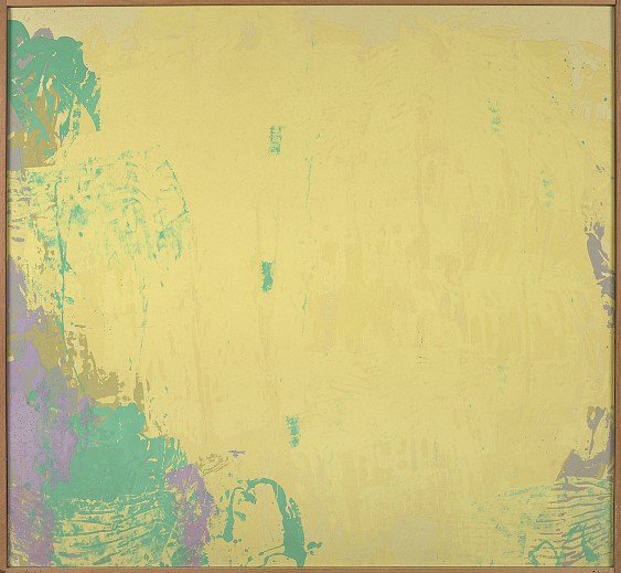
Throughout the show, in fact, the colors are lovely – and loveliest (in my opinion) when not tied down to delineation. One gets this square between the eyes when one walks into the gallery from the street and sees “Peru” (1971) right in front of the door.
Although this is another early one in the sequence, I see no squares at all. But what an exploding galaxy of merry yellow is massed in the center of the canvas, and how loosely yet tellingly it is framed by cloud-like elements of mint green, olive and mauve!
Back to News
