Walter Darby Bannard

Walter Darby Bannard News: Chelsea Summer 2022, July 25, 2022 - Michael Wolf

Chelsea Summer 2022

July 25, 2022 - Michael Wolf

Walter Darby Bannard at Berry Campbell

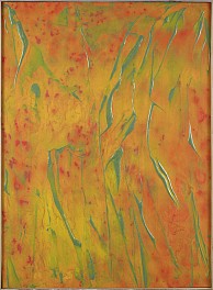
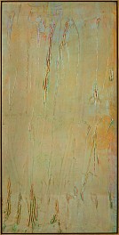
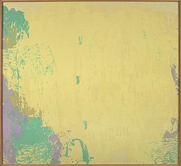
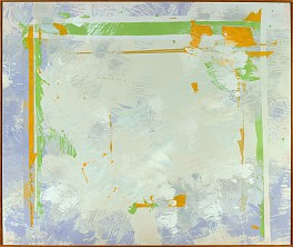
Berry Campbell presents the work of Walter Darby Bannard, a leading figure in color field painting in the 1950s. In “Vanadium,” Bannard emphasized the opticality of the painted surface, applying gesso with a squeegee leaving fine ridges. Thin layers of light green and ochre were poured and allowed to settle in the creases.

In “Glass Mountain Fireball,” Bannard’s liquid paint technique sees orange and yellow tints wash over green underpainting. While many artists are secretive about their methods, Berry says that Bannard freely explained his process, confident that other artists “aren’t going to be able to do it.” Having been the head of the painting department at the University of Miami, we can assume his claim was accurate.

Read More >>
Walter Darby Bannard News: Aphorisms for Artists: 100 Ways Toward Better Art Featured in The Critic's Notebook, July  7, 2022 - James Panero for The New Criterion

Aphorisms for Artists: 100 Ways Toward Better Art Featured in The Critic's Notebook

July 7, 2022 - James Panero for The New Criterion

By Walter Darby Bannard
Foreword and Afterword by Franklin Einspruch
 
Exhibition Review by Piri Halasz
Read More >>
Walter Darby Bannard News: From the Mayor's Doorstep: Darby Bannard's Annus Mirabilis: See First. Name Later. at Berry Campbell, June 19, 2022 - Piri Halasz

From the Mayor's Doorstep: Darby Bannard's Annus Mirabilis: See First. Name Later. at Berry Campbell

June 19, 2022 - Piri Halasz

Here I am, back in the land of the living. Still not sure whether or not I'll be able to maintain my previous pace, but meanwhile here's a review of the current & frankly beautiful show at Berry Campbell – which is "Walter Darby Bannard: See First, Name Later: Paintings 1972-1976" (through July 1).

The middle part of this tripartite title is a quotation from a slender book by Bannard recently published by Signature 16, an imprint of Letter 16 Press of Miami The book is "Aphorisms for Artists: 100 Ways Toward Better Art," and I plan to review it on another occasion, but this review is about Bannard's show, whose 16 pictures are both stunning and classically serene.

MORE BACKGROUND THAN YOU REALLY NEED
Before these paintings were made, Bannard (1934-2016) had been reasonably well-known within the art world, having appeared in two of the biggest and best-publicized group shows of abstract art in the '60s: "Post-Painterly Abstraction" (1964), organized by Clement Greenberg for the Los Angeles County Museum, and "The Responsive Eye" (1965), organized by William Seitz for the Museum of Modern Art.

However, the Greenberg show didn't include only those younger and/or lesser-known '60s painters – like Kenneth Noland and Jack Bush – whom the critic had made a point of celebrating.  Rather, it was a huge grab bag of '60s abstract painters of every kind whose sole common denominator was that instead of using the loose brushwork that had been employed by most (if not all) of the first-generation abstract expressionist painters in the '40s and '50s they were creating "hard-edged" images. 

(This trait they shared with figurative pop artists of the '60s like Warhol and Lichtenstein, who were getting far more publicity. I have long suspected that this show was Greenberg's way of showing that abstract artists of the '60s were as radical stylistically as pop – hence deserving the same attention.  "Style" to him was always the key element. "Subject matter' -- or lack of it -- was beside the point. But I digress.)

Similarly, the Seitz exhibition was a grab bag. It was intended to feature '60s paintings so "hard-edged" that they played tricks with the vision of their viewers, but only some work in the show was truly tricksy. Bridget Riley and Richard Anuszkiewicz, whose work did fit that category, soon became known as "op artists" ("op" being a term coined by my predecessor as writer on art for Time, Jon Borgzinner). But the show also included artists like Noland and Bannard whose work wasn't tricksy at all, and would go down in history as "color-field" painters or "modernists" instead.

THE MOMENT OF TRUTH
During the '60s, though, Bannard's paintings had been minimalist, not "modernist," bland in color and not only hard-edge but also geometric in composition.  Only in the early '70s did he loosen up and create more fluid, painterly and coloristically close-valued pictures.  

Such pictures would make him one of the top artists most intimately associated with Greenberg.  They would also make him a leader among the far larger number of yet younger painters who shared Greenberg's taste for the again-painterly and -- more importantly, coloristically close-valued --- pictures of Jules Olitski.

This meant that Bannard became better and better known within the Greenbergian community -- while slipping from the sight of all those "trendier" observers who couldn't see beyond the charms of pop and its intimate ally, the more familiar minimal.

It's in this context that the paintings of the current show were created – a context in which Bannard was abandoning the relatively popular and familiar in order to strike out in a new and more perilous direction.  This must have taken courage – a lot of courage – and I think that's what's incorporated into "See First; Name Later."

Although I didn't become acquainted with Bannard's paintings until the 1980s, his work from the '70s and that of the '80s form a continuum that made me feel at ease with the work in this show. I have never felt that way with Bannard's earlier minimalist work – but with this show, I had a feeling of at last coming home.

NOVEL TECHNIQUES
At the beginning of this most revolutionary period of his career, Bannard was applying paint using diapers instead of brushes and/or closing off areas of his canvases with masking tape.  So says Franklin Einspruch, former student from Bannard's later years at the University of Miami in Coral Gables, keeper of the online archive of writings by and about Bannard, and editor of Aphorisms for Artists, in his "Afterword" to that book.

Three of these very experimental works from 1972 are on view here: the still somewhat-tentative "Sampson" and "Westminster," hanging at the very back of the gallery, in a small area seemingly devoted to the thrill of discovery, and "Sometime," a miniature symphony of off-whites measuring only 14 x 10 inches and hanging on the outside wall, just to the left of the door leading to the street.

By the mid '70s, though, Bannard had discovered the joys of applying paint (and occasionally gel) with squeegees.  Especially the paintings here from the later '70s display his mastery of this humble tool. (Lisa N. Peters, in her catalogue essay to this show, says only that he used "squeegee-like tools," but Einspruch, himself a painter, says flat-out that these were squeegees.

(Although squeegees may be more often associated with garden-variety housekeeping --as workmen's tools for window-washing and floor-scraping, they come in a wide variety of shapes, sizes and forms, and are part of many artists' toolkits -- as they are widely used in studios in the making of screen prints).

THE SHOW ITSELF
Regardless of their actual dates and the actual tools employed, almost all of the paintings in this show hang together in seamless collegiality.  They are grouped together in ways that show common sweeps and coils of shape as well as contrasts in dominant and close-valued color.

This canny juxtaposition continues throughout the show. The first large gallery space is devoted to three fine pictures in a paler spectrum.  Facing the street is the vertical, putty-colored "Morning in Detroit" (1974); on the west wall is the large, nearly square and reddish yellowy "Yucatan" (1973), and with its back to the street is the grayish vertical "Vanadium" (1976), with turquoise and purple accents.

The space adjoining this space has mostly darker, mellower pictures, among them "Calico Bend" *1976), "Dakota Run" (1976), and the small but monumental "California Rambler" (1976).

Still, the most significant layout is the one that first greets the visitor upon entering from the street. In addition to "Sometime," with its startlingly early date, two other paintings share this area: "Dover Down" (1973), on the east wall, to the left of the entry, and "Cairo Passing" (1975), facing the entry. The former is built around pale, buttery browns and tans, and the latter, around vaguely grays and blues.

If, however, the visitor makes a hard right, s/he sees the mostly-light-red "Glass Mountain Fireball" (1975).

Hanging high and highly visible over the receptionist's desk, this painting indeed glows: its fundamental red ornamented with accents of green and yellow.  One can see how the image resembles a ball of fire. Yet I don't for a moment believe that the artist was trying to depict such a subject.

Like all passionate abstractionists, he had no subject at all in mind when he started to paint this picture. Only dafter it was finished did he ask himself what he was reminded of by it. In other words, he was following the dictum laid down by this moving exhibition's aphoristic title: "See First, Name Later."

Read More >>
Walter Darby Bannard News: 16 Museum Directors Show Us the Art That Hangs in Their Offices, FromArtnet News | Richard Armstrong’s Al Held to Zoé Whitley’s Lynette Yiadom-Boakye, June  4, 2021 - Artnet News

16 Museum Directors Show Us the Art That Hangs in Their Offices, FromArtnet News | Richard Armstrong’s Al Held to Zoé Whitley’s Lynette Yiadom-Boakye

June 4, 2021 - Artnet News

James Steward 
Princeton University Art Museum
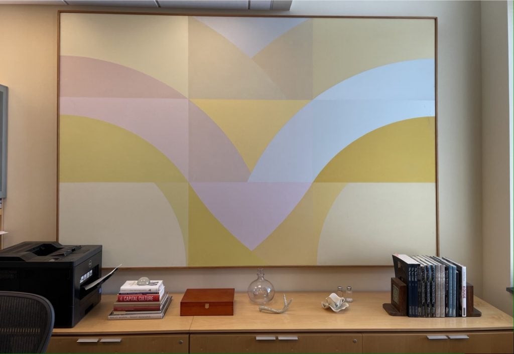
Walter Darby Bannard, <i>By the River</i> (1967). © 1967, Walter Darby Bannard. Walter Darby Bannard, By the River (1967). © 1967 Walter Darby Bannard.

One of the paintings I love living with in my office is Darby Bannard’s 1967 painting By the River. Bannard graduated from Princeton in 1957, one year ahead of Frank Stella, with whom he experimented with hard-edge abstraction while they were undergraduates. The painting fills the wall, enveloping us in its sunlit colors. —James Steward

Read More >>
Walter Darby Bannard News: Artist's Choice: Interconnected Launches Digitally, May  7, 2020 - Berry Campbell

Artist's Choice: Interconnected Launches Digitally

May 7, 2020 - Berry Campbell

Artist's Choice: Interconnected
May 7 - June 7, 2020
View Exhibition

Berry Campbell is pleased to announce Artist’s Choice: Interconnected, an exclusive online exhibition of works from gallery’s inventory chosen by Berry Campbell’s represented contemporary artists. Eric Dever, Judith Godwin, Ken Greenleaf, Jill Nathanson, Ann Purcell, Mike Solomon, Susan Vecsey, James Walsh, Joyce Weinstein, and Frank Wimberley have thoughtfully selected one work from our gallery inventory that they associate with their own creative process and artistic journey. This artist-curated exhibition is an inquiry into the lines of influence and connections within our Berry Campbell artist community. Artist’s Choice: Interconnected launches digitally May 7, 2020.

The choices are sometimes expected, and at other times, surprising.  Some artists were inspired by a painting from an artist they had never met, and others paid tribute to old friends or mentors.  Judith Godwin recalls good times with her old friend and art dealer, Betty Parsons.  James Walsh remembers a painting by Walter Darby Bannard from a 1981 show at Knoedler Gallery.  Mike Solomon pays homage to the perseverance of abstract painter and dear friend, Frank Wimberley saying: “The quiet intermingling of his experience, with the purity of painting, gives his abstractions an authenticity and delicacy that is profound to witness.”  Ken Greenleaf favorite is Cloistered #5 (1968) by Ida Kohlmeyer, delighting in the pure abstraction.  Jill Nathanson picked a color-field forerunner, Dan Christensen.  Ann Purcell admitted to being picky but found true inspiration after visiting our Yvonne Thomas show repeatedly.  Eric Dever ruminates about Charlotte Park: “Like a favorite poem, novel or even film, a painting can be a touchstone, something one returns to with certain regularity; perhaps a gauge of some kind, beginning with personal happiness on the occasion of discovery and new revelation as our lives unfold.”  Joyce Weinstein finds parallels with John Opper.  Susan Vecsey loves the “stillness and movement” of Elaine de Kooning’s Six Horses, Blue Wall (1987).  No coincidence that Vecsey lives down the road from the Elaine de Kooning house in the Hamptons. Frank Wimberley recalls of Herman Cherry: “He was one of the East End artists who wished to me to succeed.”

ABOUT BERRY CAMPBELL
Christine Berry and Martha Campbell have many parallels in their backgrounds and interests. Both studied art history in college, began their careers in the museum world, and later worked together at a major gallery in midtown Manhattan. Most importantly, however, Berry and Campbell share a curatorial vision.

Both art dealers developed a strong emphasis on research and networking with artists and scholars during their art world years. They decided to work together, opening Berry Campbell Gallery in 2013 in the heart of New York's Chelsea art district, at 530 West 24th Street on the ground floor. In 2015, the gallery expanded, doubling its size with an additional 2,000 square feet of exhibition space.

Highlighting a selection of postwar and contemporary artists, the gallery fulfills an important gap in the art world, revealing a depth within American modernism that is just beginning to be understood, encompassing the many artists who were left behind due to race, gender, or geography-beyond such legendary figures as Pollock and de Kooning. Since its inception, the gallery has been especially instrumental in giving women artists long overdue consideration, an effort that museums have only just begun to take up, such as in the 2016 traveling exhibition, Women of Abstract Expressionism, curated by University of Denver professor Gwen F. Chanzit. This show featured work by Perle Fine and Judith Godwin, both represented by Berry Campbell, along with that of Helen Frankenthaler, Lee Krasner, and Joan Mitchell. In 2019, Berry Campbell's exhibition, Yvonne Thomas: Windows and Variations (Paintings 1963 - 1965) was reviewed by Roberta Smith for the New York Times, in which Smith wrote that Thomas, "... kept her hand in, adding a fresh directness of touch, and the results give her a place in the still-emerging saga of postwar American abstraction.”

In addition to Perle Fine and Judith Godwin, artists whose work is represented by the gallery include Edward Avedisian, Walter Darby Bannard, Stanley Boxer, Dan Christensen, Eric Dever, John Goodyear, Ken Greenleaf, Raymond Hendler, Ida Kohlmeyer, Jill Nathanson, John Opper, Stephen Pace, Charlotte Park, William Perehudoff, Ann Purcell, Mike Solomon, Syd Solomon, Albert Stadler, Yvonne Thomas, Susan Vecsey, James Walsh, Joyce Weinstein, Frank Wimberley, Larry Zox, and Edward Zutrau. The gallery has helped promote many of these artists' careers in museum shows including that of Bannard at the Institute of Contemporary Art, Miami (2018-19); Syd Solomon, in a traveling museum show which culminates at the John and Mable Ringling Museum in Sarasota and has been extended through 2021; Stephen Pace at The McCutchan Art Center/Pace Galleries at the University of Southern Indiana (2018) and at the Provincetown Art Association and Museum (2019); and Vecsey and Mike Solomon at the Greenville County Museum of Art, South Carolina (2017 and 2019, respectively); and Eric Dever at the Suffolk Community College, Riverhead, New York (2020). In an April 3, 2020 New York Times review of Berry Campbell's exhibition of Ida Kohlmeyer's Cloistered paintings, Roberta Smith stated: “These paintings stunningly sum up a moment when Minimalism was giving way to or being complicated by something more emotionally challenging and implicitly feminine and feminist. They could hang in any museum.”

Collaboration is an important aspect of the gallery. With the widened inquiries and understandings that have resulted from their ongoing discussions about the art world canon, the dealers feel a continual sense of excitement in the discoveries of artists and research still to be made.

Berry Campbell is located in the heart of the Chelsea Arts District at 530 West 24th Street, Ground Floor, New York, NY 10011.  For further information, contact us at 212.924.2178, info@berrycampbell.com or www.berrycampbell.com.

Read More >>
Walter Darby Bannard News: Walter Darby Bannard Reviewed by Piri Halasz, December 11, 2018 - Piri Halasz for From the Mayor's Doorstep

Walter Darby Bannard Reviewed by Piri Halasz

December 11, 2018 - Piri Halasz for From the Mayor's Doorstep

WALTER DARBY BANNARD 

The Darby Bannard at Berry Campbell on West 24th Street show has many more successes, not least because it’s a much bigger show (with nineteen canvases on view).

I counted at least eight paintings that I really related to -- although this show is devoted to a very demanding -- because experimental -- period when the artist was transitioning from his early hard-edged and geometric minimalism to his more mature, free-formed and painterly modernism. 

It is in the nature of experimentation that not every experiment comes off, but as Clement Greenberg once advised Jacob Kainen, in a letter that I’ve never forgotten, the artist must continually take risks if he wants to renew his art (or words to that effect). 

This show appears to stop right about at the moment when Bannard began really ladling on the gel. The two last paintings in the sequence of nineteen here are both embellished with streaks of it.

One of them, “Glass Mountain Fireball” (1975), has a field of fiery reds and oranges, and is embellished with narrow upward squiggly streaks of olive green gel. The effect of such a contrast is spicy and delightful.

One of the most intriguing aspects of this show is the appearance and disappearance of the geometry underlying the free-form. Quite a number of paintings here attempt to juxtapose the two modes, and surprisingly enough, the effect can be very pleasing – or not. 

One of the most pleasing is “Summer Joys No. 2” (1970), with a summery tangle of yellows (lemon & apricot) laid atop vestiges of nine squares in pale tan and pale green.

Another charmer is “China Spring #3” (1969), in lime, mint, khaki and pale peachy pink, embellishing yet diminishing the under-drawing of a large set of tic-tac-toe squares. 

Still, one of the many virtues of this show is that it doesn’t try to establish a straightforward linear progression. 

Rather, it suggests spiral evolution from minimalism to modernism, or what the French call reculer pour mieux sauter – fall back in order to jump further forward.

“Winter’s Traces” (1971) comes early not late in the sequence, yet it is all a symphony of swaying mint, apple green and olive daubs without the slightest hint of underlying squares. 

Two years later, nearly at the end of the sequence, “The Meadow” (1973) is a forthright bright green with decidedly straight vertical lines through the body of the picture, topped with straight horizontal straight lines.

Throughout the show, in fact, the colors are lovely – and loveliest (in my opinion) when not tied down to delineation. One gets this square between the eyes when one walks into the gallery from the street and sees “Peru” (1971) right in front of the door.

Although this is another early one in the sequence, I see no squares at all. But what an exploding galaxy of merry yellow is massed in the center of the canvas, and how loosely yet tellingly it is framed by cloud-like elements of mint green, olive and mauve!

Read More >>