ART REVIEW: Mike Solomon Works Concentrate Attention and Tease Perception
June 12, 2017 - Peter Malone for Hamptons Art Hub
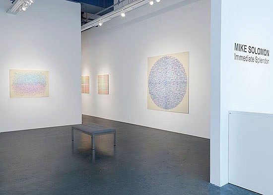
New paintings by Mike Solomon embrace an unusual variety of formal ambiguity. Uniquely and unexpectedly reticent, his resin-constructed panels, most of which fall within easel scale, present the viewer with out of focus fields of color that are compelling while still offering resistance to optical navigation. Currently exhibited in "Mike Solomon: Immediate Splendor" at Berry Campbell in New York, these works insist instead on a viewer’s steady and indeterminate gaze. Objectively speaking, they may be said to cultivate a realization of Hans Hoffman’s push-and-pull that is frozen in time.
Mike Solomon’s pictorial space appears familiarly limited in the traditional modernist sense, but is dominated by a persistent blur. Viewers are left with the odd feeling of being kept just outside of an event taking place before their eyes, yet the experience is more remarkable than frustrating. Brush strokes float in translucent layers of a pale, warm white that even in the foremost layer leave the eye straining to grasp their apparently hard edges. They hover to varying degrees in a milky cloud that teases at one’s perception, despite the consistent clarity offered by each panel’s underlying composition.
Understanding the complex technique that brings these panels to fruition stabilizes the viewer’s approach to the paintings enough to enable an appreciation of their unsettling effect—a conclusion I reached after a fortuitous exchange with the artist at the gallery. According to Solomon, each panel begins with a layer of mulberry paper, on which are painted clusters of simple watercolor strokes of a single color, or sometimes a few colors. This initial layer is then covered in an epoxy resin and sanded to as thin a depth as the pouring will allow. The next layer repeats the same technique, with new strokes adjusted to whatever compositional structure Solomon has in mind.
Some panels are more structured than others. Point, 2017, a 70-inch square comprised of four equal squares separated by razor-sharp edges, creates a floating circle of blue and violet markings, peppered occasionally with a green or red that further challenges a viewer’s attempt to affix a visual anchor to any specific depth. However, the precisely machined edges where the four panels meet leave a pencil-thin shadow that delicately accentuates a simple grid, which in turn provides a reassurance based on the frame’s containing function.
Other panels rely more on the composition itself. Todos, 2016 and Rise and Set, 2017 suggest an indistinct horizon separated by hue. Todos hovers a cerulean blue above a pale violet. Rise and Seteffects a brilliant yellow sky beyond a crimson earth. Both panels infer landscape and both leave the corners open like those in the “Pier and Ocean” series Mondrian experimented with in the early part of the last century.
.
A few works maintain a continuous field of color that bleeds off the edges, recalling the overall AbEx look of the 1950s. Radiant Acquiescence (for Mark Tobey), 2017 fits this category. Throughout the exhibition one is confronted with such nods to modernist landmarks, albeit offered as a mirage that eludes historical pretentions. Unless overtly referential (as in the piece dedicated to Tobey) they inevitably swerve from their implied precursors by their insistent emphasis on an ambiguous planar depth.
As if to balance the hazy optics, most of the compositions are easily readable, the exceptions being a set of panels that mimic, and are indeed named after the bokeh effect. The term refers to the aesthetic effect of those geometric figures that appear in the foreground of intentionally extremely out of focus photographs. Most of Solomon’s panels are built upon frank and unambiguous formats, like the trio of squares installed in the long corridor of the Berry Campbell space. These are composed of overlapping horizontal and vertical stripes that would, but for their disciplined symmetry, seem again to be cousins of Mondrian, in this instance works of his New York period. They are, in fact closer to tartan patterns than exercises in counterpoint.
That Solomon’s process is so painstakingly material suggests an attempt to separate the stuff of painting from its visual reality. If so, his work makes for an eccentric addition to that school of thought established by AbEx’s more philosophical practitioners. Examples of these, most notably, would be Rothko and Newman, whose theoretical hairsplitting sought to counter the creeping offshoot of strict formalism that contradicted their commitment to subject matter and humanist concerns.
Solomon’s work is not overtly philosophical, but he seems intent on isolating the visual from the tactile. It is an unusual approach and one that succeeds in concentrating a viewer’s attention on the image itself. In doing so, it raises questions of meaning that seem to haunt the unavoidable vagaries of abstract painting.
__________________________
BASIC FACTS: “Mike Solomon: Immediate Splendor” is on view June 1 to July 8, 2017 at Berry Campbell, 530 W 24th Street, New York, NY 10011. www.berrycampbell.com
Back to News
