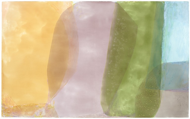
Translucence: Jill Nathanson at Berry Campbell
February 6, 2021 - Piri Halasz for Artcritical
A veteran of more than 20 solo exhibitions in New York since her 1982 debut, and nearly 30 group shows since 1980 from Massachusetts to Florida, Jill Nathanson is entitled to be counted as a heavyweight in the art scene. Ironic, therefore, that her latest show is so striking for its light, airy, almost translucent qualities, its diaphanous veils of color rooted in both science and imagination.
She learned the ABC’s of color from Kenneth Noland and Larry Poons on an informal basis in the late 1970s and early 1980s when an undergraduate at Bennington College, Vermont. Neither of these painters was on the faculty, however, and Nathanson once told me that many and maybe most of her fellow Bennington art students were making paintings that looked more like Helen Frankenthaler – Bennington’s most famous alumna – with whom Nathanson wanted her paintings to have nothing to do. And although there may be some remote similarities, the glossier-looking finish of Nathanson’s paintings and the distinctive shapes in them have long stamped them with an artistic personality entirely her own.
Nathanson’s technique differs from those used by color-field painters in the 1960s, though it employs “modelli” (preparatory studies) and in this somewhat resembles the “modelli” that Friedel Dzubas employed in the later 1970s and ‘80s. But Dzubas didn’t invent modelli. Their use goes back to the Renaissance, if not earlier. And the materials that Nathanson employs are right up to the minute – as is her abstract idiom.
Like all abstract imagery, Nathanson’s has roots in the external world. The shapes in the most novel paintings here suggest ocean waves or giant ribbons sprawling across the canvas, from right to left (with the horizontal canvases) or from top to bottom (with the vertical ones).
If it weren’t for their paleness and transparency, these shapes could be seen as collages of paper or fabric. But Nathanson uses no paper or fabric. Instead, she creates each modello out of strips cut or torn from sheets of a transparent plastic that is normally placed in front of spotlights and other theatrical fixtures to project colored light onto a stage. These transparent sheets of plastic are called “gels” in showbiz circles and sold in theatrical supply stores.
Next, the artist transfers the modello’s design by stages to a larger panel. The uniquely pale, translucent paints she employs are specially made for her by Golden Artist Colors, who since 1980 have been concocting specialized and sometimes individual paints for artists. The firm can trace its lineage back to Bocour Artists Colors, which under the leadership of Leonard Bocour sold paint to Pollock, de Kooning, Rothko and others in the 1940s and ‘50s.
As Nathanson heavily edits her finished paintings they often don’t look much like the original modelli. But the best of the current crop and their modelli have certain qualities in common. For one thing, I was struck by the paleness of the colors. They seemed to me paler than the paintings I saw at Nathanson’s last show, in 2018. While the different shapes in 2018 were impressive, with the heavier forms at the tops of her panels, hanging down or invading the central space of the picture, the current show is has these gloriously marching wide ribbons of color turning and twisting inside themselves as they make their way across the picture surfaces.
Three paintings in the first main gallery demonstrate different approaches within this unified body of work. First to strike the eye is Light Wrestle (2020). An eight-foot-wide horizontal, it offers a wide panoply of colors, starting with two broad, upward sweeping pale areas of pink and mint that surround a central downwardly-swinging area with mauve, pale grayish green and baby blue. This central area is reinforced at the far sides of the panel with further verticals of peach and pale mustard (to the left) and gray-brown, pink and blue (to the right).
Far less complicated but singularly winning is Tan Transpose, (2020). One of only two vertical compositions in the show, and standing at nearly 8 feet tall, it is structured around fewer but larger and narrower ribbon-like forms, sweeping majestically from one side of the panel to the other as they descend from top to bottom. The interstices between each loop are the colorful parts of the composition. From top to bottom, they are pale olive, lemon, mauve, a second mauve, and peach. But even more impressive, to my eye, is Light’s Cover, (2019), a somewhat smaller horizontal at six feet wide. So daringly composed of many shades of just two colors – pale greens and plums at the center, darker shades of the same at the periphery – this narrowness of chromatic range dramatizes the classic simplicity of the composition while magnifying the grace of its undulating forms.
Back to News
