...And Passion
June 24, 2014 - Piri Halasz
The other show at Berry Campbell is very different (even if coloristically it harmonizes nicely with Vecsey’s work). This show is paintings by James Walsh.
Walsh belongs to a generation born nearly 20 years before Vecsey (in 1954), but he is still a generation younger than some of those artists who established reputations in the 1960s (such as Poons, born 1937, and Bannard, born 1934. Walsh is still more removed from Noland, Olitski and Frankenthaler, all born in the 1920s).
In my opinion, Walsh, who took his BA from Rutgers University and his MFA from Syracuse University, has not yet achieved the standing that his work entitles him to. This is so despite the fact that his work is owned by a handful of museums, and despite 10 one- and two-person exhibitions (in New York and elsewhere) stretching back to 1985 at the Galeria Joan Prats (my initial exposure to his work). Walsh had a small solo exhibition at Spanierman last year, but the gallery didn't include his work regularly in their group exhibitions.
In that original show at the Galeria Joan Prats, his paintings were lovely, but not yet fully differentiated from those of Olitski, whose style influenced many younger artists in the 1980s. In the years since, Walsh has emerged as his own man.
The raised surfaces of his paintings still derive, at some distant remove, from those of Olitski in the 80s, but they now achieve far more radical thickness, and far more vigorous color contrasts (quite unlike the muted, close-value palettes of the 1980s). The whole look of the recent work is different. Nobody with half an eye could confuse a Walsh of today with an Olitski.
Moreover, the swashbuckling manner in which Walsh’s paint (often incorporating molding paste) is swabbed onto the canvas these days gives the impression of an almost fevered passion. This passion can reach such an extreme that one observer recently wondered to me whether it would be possible to live with a Walsh. To the best of my knowledge, this would not be a problem.
The 10 Walshes that I saw at Berry Campbell range in size from the very small and exquisite “Turn of Color” (2002, 18” x 14”) to the medium-sized “Ions” (2012, 41” x 27¾”). This range in size is a bit of a departure for Walsh, who in the past has worked mostly in smaller-sized canvases.
Another departure can be seen in the sophisticated “Greenscape” (2014, 30” x 24”). Here a simple – but bright – color scheme of greens, blues, black and white has been drawn across the canvas in one broad, smooth, and ultra-simple sweep, neither thick nor thin but achieving a somehow monumental balance.
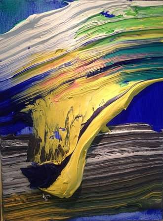
“The Distance” (2010, 34” x 26”) employs more vivid colors than I normally like in a Walsh, but gentles them through accents of other colors & restrained composition. Dominant in the foreground is a quadrangular band of almost acid yellow, swept down across a field of electric blue—but moderated with strokes of black, green, red, gray and white. Despite its relatively modest size, this painting packs a powerful punch.
Back to News