Elucidations: Jill Nathanson at Berry Campbell
June 27, 2018 - Christina Kee for artcritical
Talk of “purity” is usually best resisted in relation to works of visual art. What sort of uninflected content or form can really ever be referred to by it, after all? Jill Nathanson’s structured pourings of clear and vivid color, however, suggest the creator’s affinity with the powers of her painted medium in their most abstract sense. Beyond the transparency of the paint itself, which leads the viewer into impressions of these paintings as something aquatically pristine, there is an overall attitude of clarity and resolution in these strong and searching works. In contrast to much contemporary abstraction, Nathanson’s paintings have more to do with elucidation than complication, and seem distilled from deeply thought-through relationships of light, space, color and gravity.
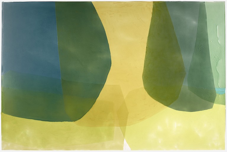
Like music – which is alluded to in the titles of this show and many works in it — the effect of Nathanson’s abstraction is built through processes of nuance and variation. In her case, the paintings expand thematically from a dominant motif of large translucent shapes that gather, overlap and appear suspended within the canvas. The edges of the forms echo both the blooming motion of a horizontal pour-and-tilt of paint, and the constraint of a taped limitation. These shape-edges generate a quiet dynamism, wandering whip-like through the radial forms of Evening Pinwheel (2017) or gracefully falling in parabolic arcs in larger works like Chant (2018) and Holding Summer (2017). Depending on the configuration, Nathanson’s forms may slowly lead the eye into what may feel like a vast space, or appear to veil some kind of more intimate enclosure. This conjuring of scale seems deliberate and controlled – and the effect, in each painting, is of a world contained and complete.
Color has been the central subject and shaping force in Nathanson ’s works for several years. While the odd moments of chromatic dissonance make it clear that her paintings are not trying too hard to please, they are often their best when channeling the most vivid brilliance and the softest, most inviting tints. Bold petal-pinks and out-and-out corals come as a genuine surprise, as do purples and crimsons that slip in a single gaze between warm and cool effect. The real uniqueness of Nathanson’s use of color comes, however, from the hard-won translucency of her medium that allows for the development of richly complex transitions and passages. The play of color in Leitmotif (2018), for example, from burnished orange to cool violet and unplaceable shades of sienna, sets up a wildly active picture plane. Individual areas of color advance and recede in varying degrees as the eye ascends and descends the ladder-like composition, here perhaps most directly recalling a melody assembled from disparate pitches and intensities.
In other works, such as Morning’s Address (2017), indirect associations with color transitions in the natural world might be permitted: the delicate difference in the shade of a rock above and below the water’s surface; the landscape beneath the shadow of a quickly scudding cloud; two overlapping leaves. This particular composition culminates in a kind of crescendo of bright white at the bottom of the canvas, as if marking the exact moment that the morning’s first rays appear. Despite their overtly non-referential aspect, Nathanson’s colors feel harvested from sensations of all that is sunlit.
Nathanson originally came to making these works through experimental small collages made from colored gel lenses used for theatrical lighting. The gels, which allow for color to be mixed as light, are an important reminder of the life of color in its fullest sense, for the paint pigment is only a conduit for a spectrum of energy. The “purity” initially intuited in Nathanson’s paintings might in fact be more akin to “immateriality,” as the works seem to suggest a departure from color as a physically grounded phenomenon towards a powerful, though weightless, force acting upon us.
The most exciting works in Cadence are also the most ambitious. Key of Be (2016) hints at risks taken in its mirror-and–tunnel like composition, resulting in refracted pairings of turquoises and oranges. In Thoroughfare (2017), an improbably assertive lavender sail shape brings angular energy into the more regular undulations of Nathanson’s forms. Both works point towards further possibilities for the striking approach so clearly established in these paintings, and suggest that Nathanson’s abstraction will avoid the danger of becoming set or static, and instead remain fluid, vital and entirely compelling.
Back to News