Nathanson at Berry Campbell: Gossamer Radiance
June 8, 2018 - Piri Halasz for From the Mayor's Doorstep
At Berry Campbell in Chelsea, we have “Jill Nathanson: Cadence” (through June 30). This lovely show, of 17 shimmering veils of color, picks up where the artist’s notable last show left off, and carries the unique presence she has established on to new triumphs.
I dealt at some length on Nathanson’s earlier career and the special technique she has developed in covering that last exhibition -- in June 2015 -- so I don’t have a whole lot to add.
A graduate of Bennington, where she learned about color (on an informal basis) from Kenneth Noland and Larry Poons, she still employs modelli or preliminary designs in the form of collages made of translucent sheets of color.
Then she expands them into larger, finished paintings employing a combination of acrylic, polymers and oil developed with the aid of those magicians of paint supplies, Golden Artists Colors.
The result is compositions composed of groups of shimmering, transparent planes of color that mingle and overlap one another – creating additional colors when the planes overlap. But even when they do, they remain so pale and ethereal that they are exceedingly difficult to reproduce in photographs or online.
These are paintings that really need to be seen in the flesh to be fully appreciated.
On the whole, this is a truly beautiful show, with a high percentage of successes. The least successful tend to be those where the artist has embellished her basic large planes of color with narrow little strokes of oil paint, added with a brush—too often, these just look fussy or awkward.
Perhaps they will look better, when she has learned to handle them with more confidence, and perhaps I am just going through a phase where I like my images as clear and simple as possible.
Anyway, to me among the most successful paintings in the show were the simplest—and many of those fell into certain categories – which I called Types A, B and C.
The one I call “Type A” tends to be a horizontal, rather than a vertical, and is distinguished by a row of forms that hang down from the top side of the panel on which they are painted (all the paintings in the show are on panel, not canvas).
One of the earliest opinions I heard about how to compose a painting was that an abstract painting was likely to “work” best if its larger and/or darker forms were at the top of the painting, descending toward its bottom. These “Type A” paintings all handsomely vindicate that opinion.
Among them are “Chant” (2018), “Time Signature” (2018), “Possibly Minoan” (2018), and “Morning’s Address” (2017).
The last-named is especially nice -- dominated at the top by a clear blue rectangular plane of color at the left, similarly-shaped greens at the left, and a smaller slice of creamy lemon in the middle. At the bottom are narrower horizontal bands of paler limes and lemons.
Another common format is “Type B,” with just a few large, simple shapes crowding in from three or four sides of the panel. These paintings are more apt to be verticals or nearly square.
Examples of this type are “Merest Drop” (2018), the charming little “Second Pinwheel” (2017), “Wavicality (2016), and especially “Timbre” (2018).
Of the four, “Timbre” is particularly winning, with its framing elements – at the top and on the sides – the palest possible greens and grays. At the center bottom, an open space of pale lime creates the impression of a secret garden glimpsed through a frame of darker hedges.
A third and less frequent composition might be called “Type C,” in which the dominant, hanging shapes appear to be marching horizontally across the panel. One of these is the smaller “Holding Summer” (2017), with medium blues and cerise across the top, and palest aqua at the bottom.
Another is the singularly delicate “Neighboring” (2017), with a grayish mauve area at the left, an overlapped pale brown next, then a pale mustard and then finally a creamy gray.
And of course, some of these paintings don’t fall into any of these types. “Wing” (2017-2018) looks like a huge flower, with enormous petals of pink, olive, mauve and mint radiating out from a central green blob (very possibly added with a brush??) that looks like a pistil (the botanist’s name for the center of a flower).
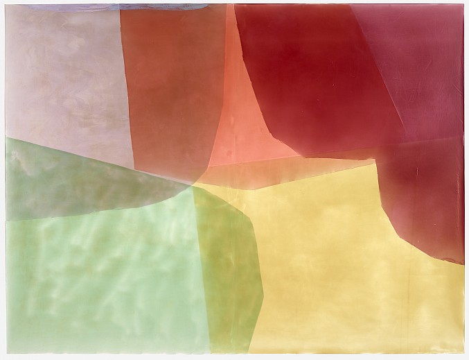
Another painting that defies categorization is “Cadence” (2017), the painting for which the whole show is named and which is illustrated here. The colors are maybe even paler than they appear in reproduction, but they are still succulent – which I mean in the most literal possible sense: good enough to eat.
They are also most beguilingly off-center, with the apricot-yellow core floating down the lower right-hand corner, and its complementary framing elements clustering around it.
Beginning in the lower right and progressing around in a counterclockwise direction, they run a gamut of radiance—from the upper right to the top and the top right: mint, gray, rose and finally, a deeper-still rich plum.
Back to News